Beating biases
This week my brain has kept on trying to warp my perception of English COVID figures. When Boris threw English doors to COVID wide open on ‘Freedom Day’ (July 19th), he was criticised in many quarters as ‘wildly’irresponsible ‘. Projections were made by some epidemiologists that daily COVID cases might rise as high as 100,000 per day. I thought too that rapid opening up was misguided, with my concerns particularly around England becoming a breeding ground for vaccine-resistant and more infectious COVID strains. Johnson argued that mass vaccination had weakened the link between infections and severe illness and deaths in England, and that easing restrictions now would avoid a rise in cases in peak winter, while also helping to get the economy back up and running. So what actually happened?
What happened was, the cases peaked right around Freedom Day, then started to drop. Hospitalisations and deaths have climbed, but at nothing like the rates or scales seen in previous infection waves (note that both are delayed from peak infection, because it takes around two weeks for people to get seriously ill after they are diagnosed, but that two weeks has passed). In the 3rd wave, 50% of NHS beds were filled with COVID patients, now only a few percent contain COVID patients (as reported in an interview with Kim Hill on National Radio today). My brain kept saying, “There must be a reason that you are not seeing what you expected. Go look for the reason that the graphs are wrong.” This is a very unscientific thing for my brain to do, and I am a scientist. So what is the problem here?
The problem is that I have a very normal brain, which is much keener to look for and see evidence that its beliefs are correct, rather than incorrect. I had exactly the same problem last week, when someone pointed out that it seems quite surprising that Māori managed to cause extinction of all moas, even in areas that were very lightly populated like the West Coast of the South Island. “But the timing of moa extinction around 200 years post-Polynesian arrival, seem too closely aligned.”, my brain shrieked. “Not to mention, we see the same sorts of pattern all over the globe, loss of megafauna when humans arrive in an area.” Whatever my brain likes believing in, the question is valid. What caused the moa to die out when human populations were low and some moa lived in extremely dense bush i.e. were hard to hunt. Moreover, there is no evidence of widespread fire taking out both bush and moa on the South Island West Coast, as there is on the east side of the South Island.
An alternative hypothesis that has been tested, is that moa were already in decline when Polynesian settlers arrived. However, investigation of moa DNA from bones shows no evidence that this hypothesis might be correct. It is also possible there is an indirect link between Māori and moa e.g. the kiore that Māori brought may have developed a liking for moa eggs and dense bush would have been no problem for them.
Another interesting part of my investigations in regard to the decline of the moa was when I looked up what pre-European Māori population levels might have been. It turns out that we really don’t know. The number commonly bandied about has been 100,000, which was estimated by Cook. However, there is very little evidence this number was well founded. Considerations of likely population density in Polynesia and other higher latitude countries, suggest that there may have been 200,000 or more people in New Zealand when Cook arrived. It is possible that lower figures have sounded less appalling in terms of how many people died as a result of European colonisation; by 1858 a census found there were only 60,000 Māori in New Zealand.
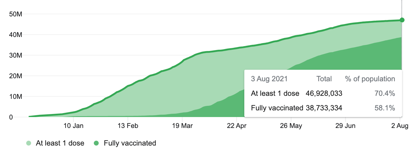
But back to COVID-19 and England, why are the daily COVID cases dropping. According to one epidemiologist, “ nobody really knows what is going on “. It apparently is not related to herd immunity as it has happened everywhere, and herd immunity is likely to develop in a much more patchy fashion (and has been predicted at higher levels of immunisation than the UK has yet achieved where 70% of people are fully vaccinated). Explanations posited include:
- Infection rates were primed in July by the delayed Euro2020 football tournament leading people to congregate in public and private gatherings (this is backed up by the numbers of infections in males). Modelers noted that they didn’t predict the impact of the football tournament.
- The end of the school term on 23 July.
- Warmer weather leading to more outdoor socialising.
- Fewer people getting tested (test numbers have fallen but the proportion of positive tests has also fallen, so this is not so likely to be a major reason).
Modelers predict that rates of infection are likely to climb again in September, when people move inside, schools and universities return and protection from the first round of vaccines starts to wane. And, of course, it is testing of predictions/hypotheses that drives the process of science. The modelers don’t think their job is done because they created a model, they are continuously looking to see whether it matches what happens in reality and updating it with data from reality. Data is what takes the human brain out of the picture (as does Artificial Intelligence, but that is a whole other story and problem) and thus helps us to see more clearly, while noting that humans can also manipulate data to suit their own ends.
Having managed to influence my own thinking to some degree, I went to look at the Johns Hopkins coronavirus map and the associated graphs of the progress of COVID. Even a few days ago, the UK was the only country where the daily case figures were clearly in decline. But now, when I look at the graphs, some countries have have declining rates of daily COVID cases (Brazil, Russia, Argentina, Colombia, Indonesia, South Africa, Netherlands) and many could be seen to be at the top of the infection curve where I might have seen them as on the rise (France, USA, Argentina, Spain, Italy, Iran, Iraq). How much difference a change of attitude can make – seeing peaks rather than increases. I had to get to the 27th country on the Johns Hopkins list (in order of total COVID cases reported) to find a country where there might still be exponential increase – Malaysia. Was the UK a harbinger rather than an outlier? 2 days ago epidemiologists were saying the UK cases ‘are a mystery’, by next week will the ‘mystery’ have been solved, as more data comes flooding in?
I challenge you as readers to think, when did I last want to believe in something enough that I kept steering my brain away from what I could see was actually the case? And what does it take to change my mind?


Get new content delivered
directly to your inbox.
Latest Posts