
Facing off against COVID-19

My mate Toti from Taupo presents different faces to the world (please note, he is a confirmed bubble member, present from midnight on Tuesday). I feel like I am cycling through those faces at a rapid rate during the days. I wake up and feel reasonably calm, particularly if I pick up my current book, which is an adaptation of a fairy story by Neal Gaiman (a great writer if you like science/imaginary fiction). But there’s only so long I can keep myself away from checking on what happened overnight; I think everyone is struggling with this right now – how much news is enough? I read the news, and I rapidly shift down the Toti column to the bottom of the emotional pile. It then requires a concerted effort to take myself for a walk, dig a plant hole, or talk to the chickens in order to work my way back up. I am not forgetting to use my breathing exercises, either – part of my new routine is using them to clear my brain before starting writing each day.
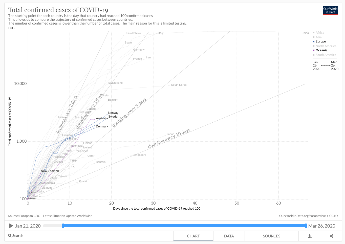
However, part of my routine is also checking our-world-in-data to watch the experiment progress. I realise that there is a degree of futility in day-by-day checking. Such checking is a bit like watching the stock market on a daily basis (not that I am currently watching the stock market because thoughts on world economic futures are not somewhere I can currently let my brain safely travel). There is a little more information in the graphs and tables every day, but only over time will the patterns emerge.
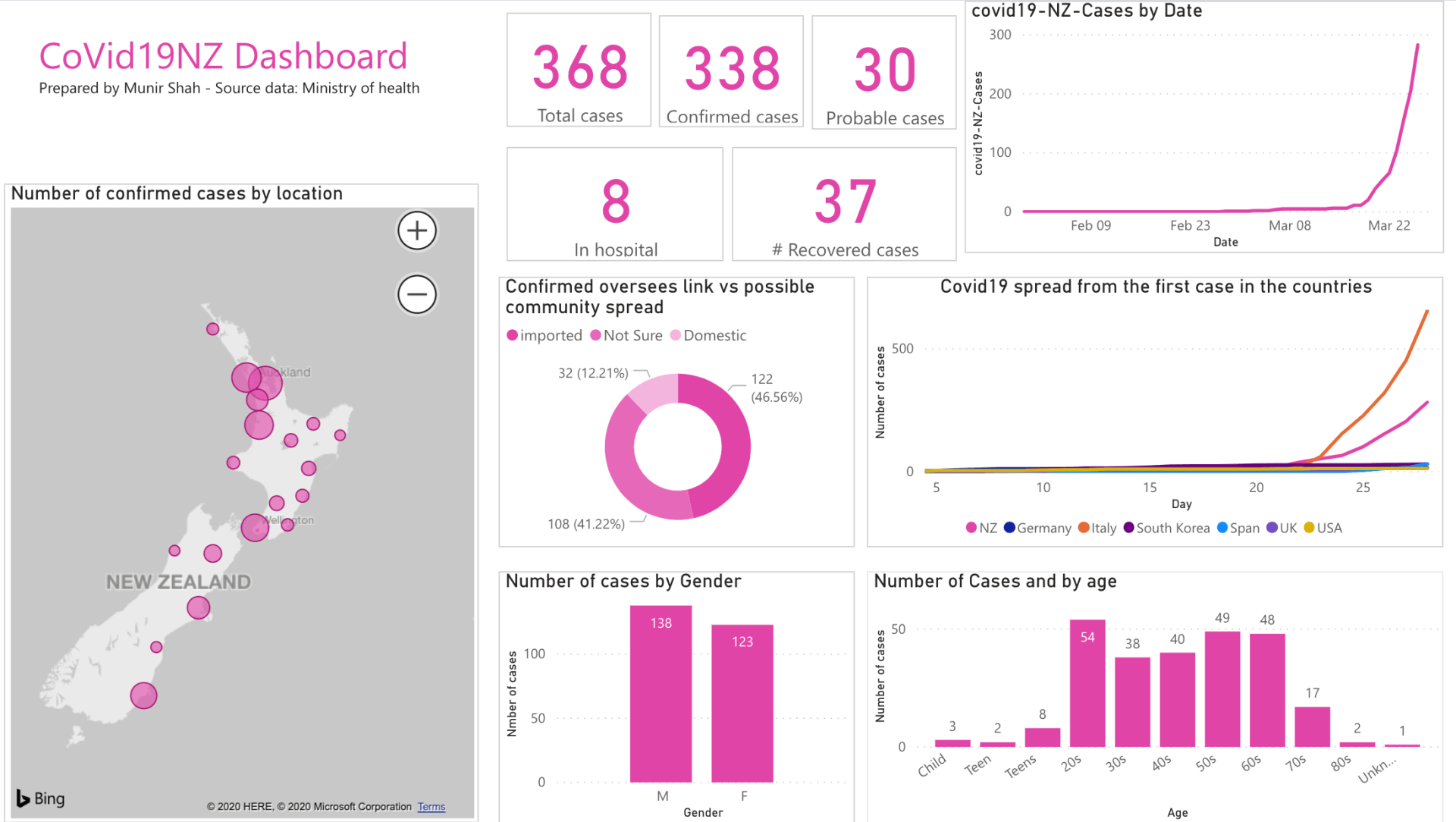
One of my friends gave me this link today to a page which is an infographic of New Zealand’s Ministry of Health data (the data is useful but hard to absorb without depiction). I have pasted today’s infographic below because it doesn’t want to automatically display in WordPress. The numbers that interest me most on this graph today are those related to overseas links vs domestic spread of the virus. Our goal as a population is to minimise spread; we won’t see our Level 4 bubble-behaviour effect on that spread for at least 10 days, however we can see the degree of internal spread that we are trying to counter. We now have 32 cases of virus transfer which were definitely domestic and 108 cases which may be domestic transfer.
In regard to the running experiments, here’s that same our-world-in-data graph again for today, with NZ, Australia, Norway, Sweden and Denmark highlighted. I was asked to include Denmark into the mix because it is reasonably similar to Norway and Sweden in terms of demographics and society and because three data points are better than two (no prizes for guessing this was suggested by a scientist). On 18 March Denmark went into a lockdown situation similar to NZ’s (preceded by a partial lockdown on 13 March), although apparently people can still congregate in groups of up to 10. Norway’s lockdown started 12 March (though it isn’t as restrictive as NZ’s, either). Sweden is gradually implementing restrictions, though gathering size is still at 500 people, and are now suggesting that people work from home and that educational institutions close.
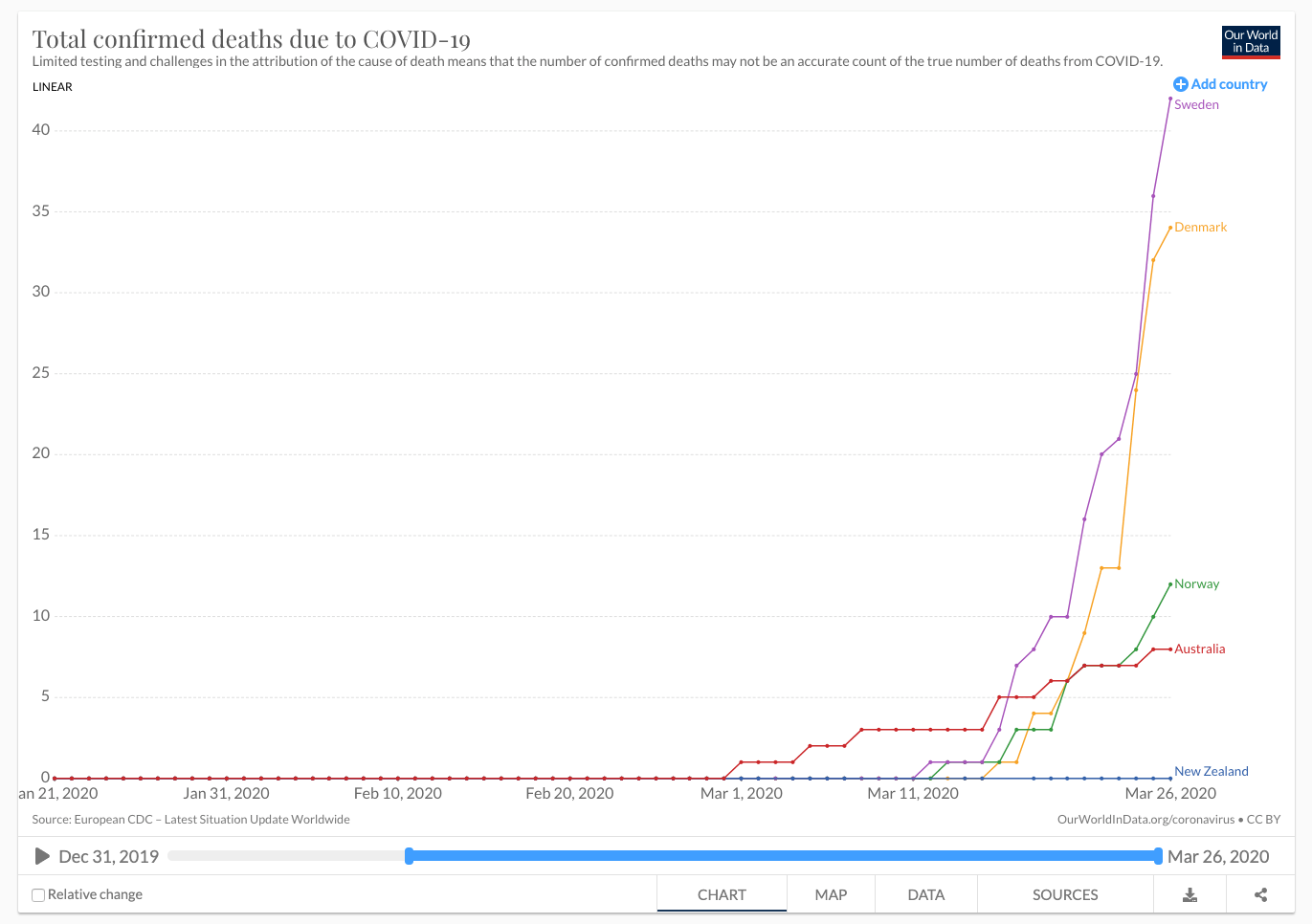
My problem with the data is, however, that when I read about who is being tested, I am starting to wonder how meaningful the confirmed case numbers are. Countries all have their own guidelines for who is eligible to be tested (you can hear the NZ Director General of Health getting grilled on this daily) and it is sounding like many people who are symptomatic are not eligible; in Sweden the Stockholm region is only testing at-risk people who are hospitalised and medical staff. How disappointing, the window into the experiment may already be closing. So let’s ‘pivot’ (trendy research word) to look at deaths instead. Death statistics can still be skewed because it depends what cause is attributed to the death, and how many people die will depend on the levels of medical facility available, but at least death stats are much clearer in terms of being countable, so should give us an idea of the comparability of country strategies for the time being.
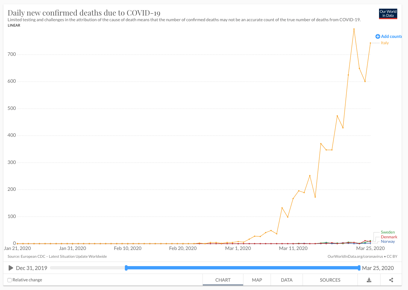
A small ray of hope is that, for the last 4 days, the deaths in Italy have varied between 650 and 750 people per day, but the previous exponential trend has tailed off. Italy introduced lockdown measures on 9 March.
Today it seems like I have really submerged you with data. So, in compensation, here are a couple of coronavirus videos that people have shared.
Get new content delivered
directly to your inbox.
Latest Posts