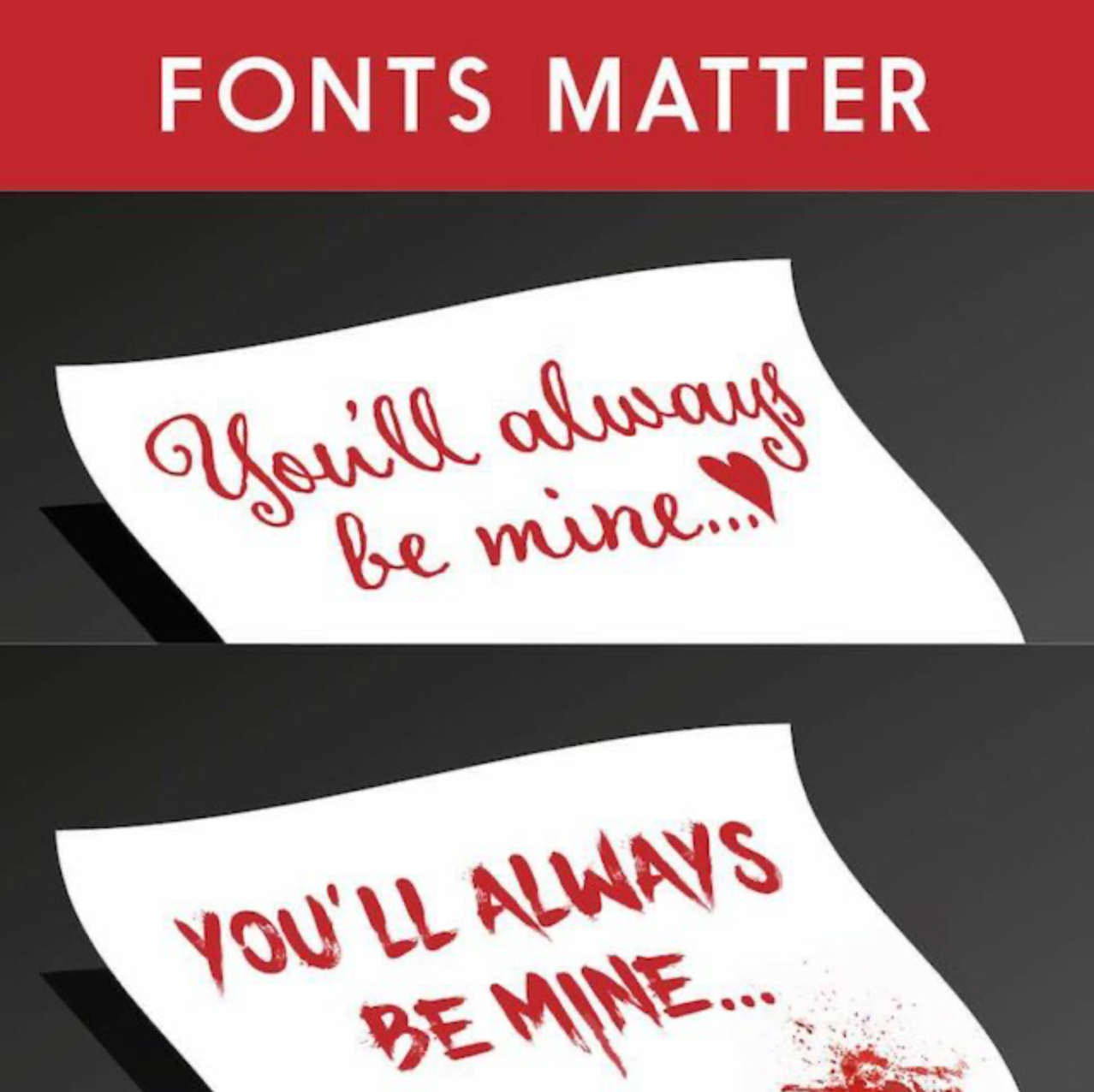
What’s in a font?
Nothing to do with fonts but the view from the top of one of my favourite local mountain bike rides - third time in a week at Skippers Saddle!

Does a week go by in which there isn’t some weird and unfortunate news out of the USA? It’s a big country, there’s plenty of room for Americans to create weird news. But reversing a government decision to use a particular font in diplomatic communications because the font change was a pro-diversity move? That’s a goodie.
I could write about FIFA giving the Commander-In-Chief a peace medal – sucking up extraordinaire? Or about the proposed requirement for ESTA visa applicants for the USA to provide 5 years of social media information (how would one do that…it’s not like I have a log of all my social media posts). You could be denied an ESTA because you’ve criticised the incumbent President on social media – an interesting move for the ‘land of the free’. However, I’ve chosen the font item to headline today.
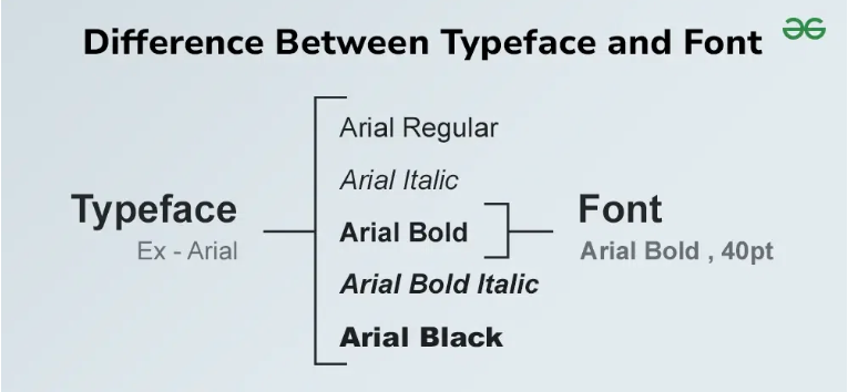
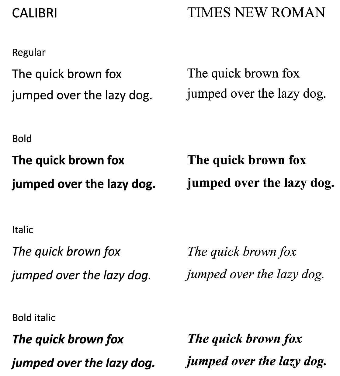
US Secretary of State Marco Rubio says his predecessor’s switch to Calibri for diplomatic documents, from Times Roman, was “another wasteful DEIA program” and the font is too informal. In 2023, Antony Blinken mandated the change to Calibri, 15 point font, because this font (including both its design and slightly larger size) improves readability for low-vision, dyslexia and screen reader users. Note that, while ’typefaces’ and ‘fonts’ are often used interchangeably, ‘typefaces' are families of fonts – fonts are the specific size, weight, slope and width of the letters e.g. 14pt, bold, italic Times New Roman is a font while ’Times New Roman’ is a typeface.
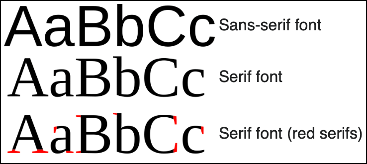
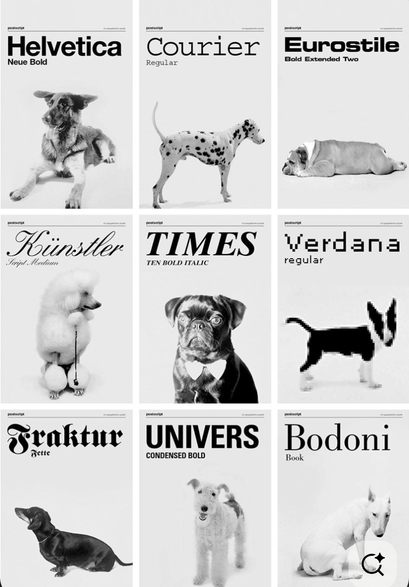
Times New Roman is a ‘serif’ typeface and Calibri is a 'san serif' typeface: ‘serifs’ are the little tick marks which appear on some fonts. While there are a gazillion typefaces you can use, they exist in two groups: serif and sans serif.
Serifs originated from early Greek and Roman writing on stone. Supposedly, letter outlines were first painted onto stone and the stone carvers followed the brush marks, which flared and stroke ends and corners. Another theory is that serifs were devised to neaten the ends of lines.
Typography – the art of arranging written letters into visually appealing, legible text – originated with the printing press in the mid-1400s. Gutenbergs first printer, used metal type based on handwritten Gothic scripts which were beautiful, but difficult to read. As printing expanded across Europe, designers and scholars sought typefaces that were elegant, balanced and readable. This led to the design of serif typefaces, based on writing carved in stone.
Serifs guide the eye from one letter to the next, making long form reading more comfortable. This is why long form media such as books, newsletters and academic publications commonly use serif typefaces. Because serif fonts are old and because of the forms in which they are commonly used, serif fonts are associated with tradition, trust, craftsmanship, and authority. Times New Roman, the best known of the serif fonts, was created for The Times newspaper in 1931. It’s efficient, compact and optimised for dense text columns.
San serif fonts, on the other hand, have become the most common typeface used on computer screens. Sans serif fonts have been common in writing across history; Wikipedia notes they have been common in ‘uncultured writing’. The earliest printing use of sans serif fonts was in the 1700s, to represent inscriptions in Ancient Greek and Etruscan. By the late 1700s, architects and artists starting sing sans serif fonts and they became popular for advertising because they grabbed attention as a ’new’ way of writing. Sans serif became popular in the 1800s in advertising and displays due to their clarity and legibility at a distance.
Through the 1800s and early 1900s, sans serif types were viewed with suspicion by printers – they were seen as only fit for advertisements! In addition, many of the common sans serif fonts of the time were somewhat lumpy and eccentrically shaped. However, more designs were released in the early 1900s and sans serif fonts gained acceptance, becoming seen as modern and minimalist. Calibri was a latecomer to the font party – it was released in 2006 with Windows Vista (that was one terrible operating system) and described as having a ‘warm and soft character'. In Microsoft Office 2007, it replaced Times New Roman as the default font in Word and Arial as the default font in PowerPoint, Excel and Outlook. Calibri reigned for 17 years until Microsoft replaced it with Aptos in January 2024.
Rubio says Times New Roman is more professional and authoritative than Calibri; it suits courts and legislatures. Switching to Calibri ‘achieved nothing except the degradation of the department’s correspondence’. He also noted it clashed with the typeface of the State Department letterhead. Rubio's return to Times New Roman also aligns with President Trump’s ‘One Voice for America Foreign Relations’ directive; the Department must present a unified, professional voice in all communications. Rubio says Blinken’s change was ‘wasteful’ and had cost $145,000 (there is no evidence provided for this number).
There is indeed a minor efficiency argument regarding font size:
- 14 point Times New Roman - 16.8-17 points, 22.4-22.7 pixels
- 15 point Calibri - 18.5-19.5 points, 24.6-26 pixels
In physically printed documents, Times New Roman will result in fewer pages. On a screen, it really doesn’t matter. It’s also hard to imagine how this new change of font isn’t equally wasteful of people’s time as the previous change as they adjust their document templates.
This blog is written in a sans serif font (Akkurat). Akkurat is a "clean, rational, quiet, but with subtle human details that keep it from feeling cold.” My general preference is for the clean and simple feel of sans serif fonts, rather than the ornateness of serif fonts, however ‘professional and authoritative’ they might be. Rather than worrying about my font, though, do I need to consider my likely eligibility for an ESTA visa. I fear such concerns are already too late...
Get new content delivered
directly to your inbox.
Latest Posts